Quick links
Colorspaces
Colorspaces can either be additive (key colors are added together to get white) or subtractive (key colors are removed to get white). Light-based color systems for screens are additive, and pigment-based colors for printing are subtractive.
| Colorspace | Syntax | Usage |
|---|---|---|
| RGB | color: rgb(RR, GG, BB); |
Define colors using values for each color channel |
| RGBA | color: rgba(RR, GG, BB, 0.A); |
Define colors using values for each color channel (0–255) as well as alpha opacity (0.0–1.0) |
| Hex | color: #RRGGBB; |
Define colors using the hexidecimal code (equates to RGB values) |
| Named colors | color: name; |
Use pre-defined CSS colors for solid, plain colors that are fully opaque |
| HSL | color: hsl(HH, SS%, LL%); |
Defines color by hue (0°–360°; red is at 0°), saturation (0%–100%), and luminosity (0%–100%) |
| HSLA | color: hsla(HH, SS%, LL%, 0.A); |
Defines color by hue (0°–360°; red is at 0°), saturation (0%–100%), luminosity (0%–100%), and alpha opacity (0.0–1.0) |
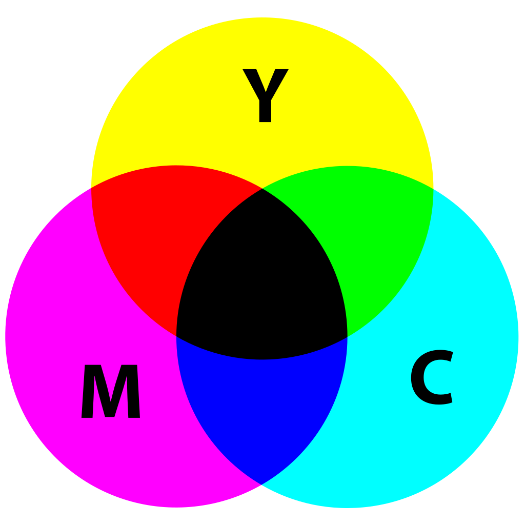
| CMYK | C: CC% M: MM% Y: YY% K: KK% |
Defines color based on a four-coordinate system from four key pigments used in printing: cyan, magenta, yellow, and black. |
RGB, RGBA, and Hexadecimal
These three color coding systems can all reference the same colorspace coordinates (with the exception of alpha in RGBA). Hexidecimal values are simply the hexidecimal equivalent of that color channel’s value from 0–255: 00–FF.
The colorspace can best be illustrated as an XYZ plot, where each color channel (red, green, blue) has its own axis. At (255, 255, 255)/#FFFFFF, the final result is white. At (0, 0, 0)/#000000, the final result is black.
Alpha opacity is simply a value from 0.0–1.0, where 0.0 is fully transparent and 1.0 is fully opaque.

Named CSS colors
These colors function as keywords in a lookup table, to give commonly used colors a more human-readable name (example: orange rather than #FFA500). The keywords are limited and not always supported on older browsers.
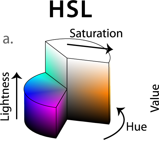
HSL and HSLA
This is the most intuitive HTML color format, since it defines color based on its properties rather than its channels.
Hue refers to the degree of the color; pure red is at 0°/360°. Pure green is opposite at 180°.
Saturation refers to the magnitude from the origin, on a scale of 0% (fully desaturated or gray) to 100% (fully saturated or colored).
Luminosity is different than value; while they both refer to the height of the cylinder, they affect the final color in different ways. Luminosity is defined from 0% (black) to 100% (white), and value is defined from 0% (black) to 100% (fully saturated, full brightness). A 100% luminosity value will always be white regardless of the color.
Alpha refers, as always to the opacity: a value from 0.0–1.0, where 0.0 is fully transparent and 1.0 is fully opaque.
CMYK
CMYK colors are created by combining colored ink on paper to create blended colors. This is typically referred to as process printing, either 4-color (CMYK) or 6-color (CMYKOG). 6-color process printing adds a green and orange pigment since those are hardest to produce with 4-color process. CMYK colors are most commonly used with inkjet and laserjet home printers and digital printing presses.
Since black (K for “key”) typically prints more of a dark charcoal gray, most printers will use a rich black that combines all four colors in different amounts for a richer, darker black. For example:

C: 50%
M: 40%
Y: 40%
K: 100%
Pantone
Pantone colors use a single pigment for their defined color. This can be helpful when needing to match specific colors, and Pantone inks are most commonly used in offset printing. To match process colors to Pantone colors, create a spot color that looks as close as possible in natural sunlight.
Color properties
Color temperature: how warm (reddish) or cool (blueish) a color is. Warm colors can promote feelings of aggression and energy, and feel bolder than cooler colors. Cool colors are used for more calming, ‘quieter’ interfaces.
Tints and shades: how close to white or black a color is. Closer to white is tinted, closer to black is shaded.
Color schemes
There are four commonly used color schemes used to develop color palettes for design:
Monochromatic: all colors have the same hue, with variances in saturation and/or luminosity. Common in simple, clean interfaces with minimal visual distraction.
Complementary: colors are opposite each other on the color wheel. This creates a high contrast, high energy design and is very common in logos and uniforms. Use this for areas that need to grab the user’s attention.
Analogous: colors are next to each other on the color wheel. Typically this involves one dominant color, a support color, and a third accent color. This creates a visually pleasing and calming color palette, but is low-contrast. Use this for backgrounds or areas that don’t need to direct the user’s attention.
Triadic: colors are offset in thirds (120°) on the color wheel. This creates a sense of equality, vibrancy, and security in the color palette.
Once you’ve selected a color scheme, you can further develop it by taking the color palette and varying it within saturation and luminosity for your selected colors. Paletton is a very effective tool for setting up color palettes with any of the above schemes, and grabbing HTML color codes directly from the page. Adobe’s Color Wheel tool is another option, and also has contrast and accessibility tools available for user-selected colors. Cloudflare’s Color Palette tool can randomly generate color palettes as well as accessible color contrast pairs within each palette.
Contrast
A very important aspect of color schemes is making sure there’s appropriate contrast between color elements. The WCAG recommends various contrast ratios for better visual accessibility; higher ratios mean text is easier to read.
Use Lea Verou’s Contrast Ratio tool for checking contrast ratios between various background and text colors. It updates in realtime to reflect your chosen colors, the contrast ratio, and how it will appear in text on a background.
Color psychology
Color associations can vary between cultures and parts of the world, so these are far from universal. For example, Chinese culture views red as a lucky, auspicious color whereas American and other western cultures use red to indicate warnings, errors, or buttons to close/cancel.
Red: passionate, angry, energetic
Orange: optimistic, playful, fun
Yellow: welcoming, intellectual, impatient
Green: prosperous, balanced, growing
Blue: peaceful, loyal, cold
Purple: imaginitive, royal, spiritual
Gray: unemotional, compromising
White: innocent, pure
Black: luxurious, powerful

Best practices
Use neon colors sparingly. While the use of neon colors can feel hip, they are often hard on a user’s eyes.
Avoid vibrating colors. Vibrating colors result from pairing two colors with high saturation together that may be complementary to one another. It creates a glowing or moving effect, which also can be hard on one’s eyes. For example, the red and green pairing that is common with Christmas cards is very glaring when presented on a screen: These are vibrating colors.
Use backdrops or outlines to separate vibrating colors. Separating or reducing vibrating colors with a white or black outline/backdrop can make the effect more bearable for users. For example: ▮
Avoid color combinations with insufficient contrast, including bright colors on top of bright colors (bright on bright), light colors on top of light colors (light on light), and dark colors on top of dark colors (dark on dark).
Sources
“File:RGB Color Cube.svg,” Wikimedia Commons, Wikimedia Commons, 6 Jan 2015, https://commons.wikimedia.org/wiki/File:RGB_color_cube.svg.
“File:Hsl-hsv models.svg,” Wikimedia Commons, Wikimedia Commons, 24 Jun 2020, https://upload.wikimedia.org/wikipedia/commons/a/a0/Hsl-hsv_models.svg.
“File:CMYK_subtractive_color_mixing.svg,” Wikimedia Commons, Wikimedia Commons, 28 March 2017, https://upload.wikimedia.org/wikipedia/commons/c/c9/CMYK_subtractive_color_mixing.svg.
“Color Theory,” Front End Engineer Career Path, Codecademy. https://www.codecademy.com/paths/front-end-engineer-career-path/tracks/fecp-improved-styling-with-css/modules/fecp-learn-color-theory/lessons/learn-color-theory/exercises/color-schemes.